Willard Woods
Services Provided
+ Brand Messaging + Positioning + Look and Feel + Identity Design
Brief
Willard Woods is a fresh and relaxed, modern luxury lifestyle brand working to deliver sustainable luxury goods for the minimalist consumer.
Challenge
Tell the story of a silent luxury brand looking to simplify luxury to offset the loud luxury buyer.
Results
A cohesive brand strategy and look-feel was developed to explore how Willard Woods is setting a new standard of living, subtly.
The Truth
The Lifestyle Brand.
To know how to create the brand messaging, I asked the client what the origin of Willard Woods was. He told me it was the neighborhood in which he grew up in. How there is a woodsy area with a nice lake, which is truly his favorite place. The client’s mission is to deliver sustainable and luxury goods for the minimalist consumer, in a way that’s different than other outspoken luxury brands.
Brand Statement
Willard Woods exists to simplify luxury.
Luxury isn’t about loud, ornate, and gaudy products. It isn’t about doing it to look better in the eyes of others. Luxury is about living with a renewed sense of life. Inspired by a pocket of nature, Willard Woods’ mission is to provide ways to be fresh, without all the noise of the world. To do it for the betterment of the self and connect back with the essentials with a modern, holistic approach.
Setting a new standard of living, subtly.
Positioning
The combination of audience, purpose and proof points to position the brand.
Audience
The committed consumer with an interest in minimalism and the world.
Purpose
Willard Woods exists to simplify luxury.
Proof Points
Embracing
Essentials
Sustainable
Minimalism
Actualizing
Growth
Positioning
Willard Woods, getting back to the roots of natural elegance to nourish the self.
Tone of Voice
How the positioning is expressed to the audience – digitally and IRL.
Fresh/Thoughtful
Relaxed/Modern
Inspirational/Curious
Key Messaging
Grow Lightly.
At Willard Woods, our brand carries an affinity for decluttering the status quo of luxury. Working with simplicity in mind helps to ensure we include what elements are necessary, exuding a feeling of lightness.
Embracing the essentials means all parts of the design/product are thoughtfully considered. By trusting the process, we ensure the design flows from edge-to-edge and the products use quality, sustainable materials.
Thinking different from the mainstream, living life to your own rhythms and purpose, becomes a way of actualizing growth. Setting high standards and working meticulously.

Identity
The Logo
The Willard Woods logo is designed to feel sophisticated and lively by way of modern, vintage serif letter forms, carrying a slight rustic aesthetic.
The icon is made by merging the two ‘w’s, playing off the alliteration of the brand. It’s cleaned up by removing the inside hairline stroke.

Color Palette
System utilizes a primary grey tone to play off of neutral modernity. Palette brings in colors based on the mood board and possible sources of self-growth.
Natural Grey
Energy
Light
Love
Restful Black
Color Application
The wordmark letters will only be shown in Restful Black or White to evoke elegance but, may be used over a color background.

Photography
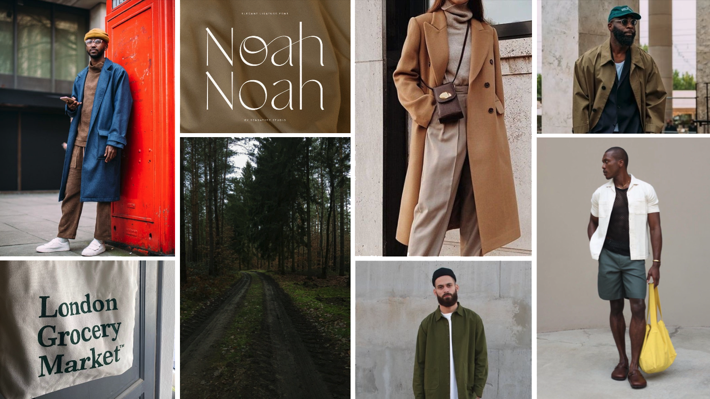
The imagery should contain tones like those found in the color palette. When showing people, subjects should feel like an organic part of the composition, with an aspirational aura. Photography shall always seek outdoor environments or natural elements.


Design Application
PR Box Kit
The PR Box Kit will come with a branded relaxed t-shirt, three sample essential oil bottles, and a scented candle. The box will contain simple floods of color with inspiring text on the outside lid, with the brand statement on the inside.


Instagram Post Carousel
Carousel introducing Willard Woods and the idea of ‘grow lightly.’

Website Homepage
Example website homepage concept, with vertical tabs to discuss the proof points and a section devoted to the key messaging established.

