
Tishman Speyer White Paper
Services Provided
+ White Paper Design + Copy Layout + Photo Selection + Data Visualization
Project Team
Doner Strategy: Mark Jacob + Julie Murray + Chris Hibi
HarrisX Researchers: Julian Bastone + Jennifer Yellin
Yamamoto Copywriter: Dennis Cass
Doner Designers: Reid Jacobs + Alex Sheldon
Brief
Create a modern white paper that brings real-world data to life and reinforces “Where Matters” as it pertains to Unlocking Human Potential.
Challenge
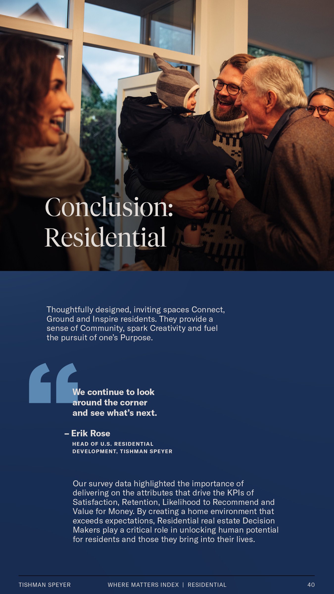
Evolve the brand to include flexible brand colors and lean into using full-bleed imagery to add vibrancy and life to the page and content.
Results
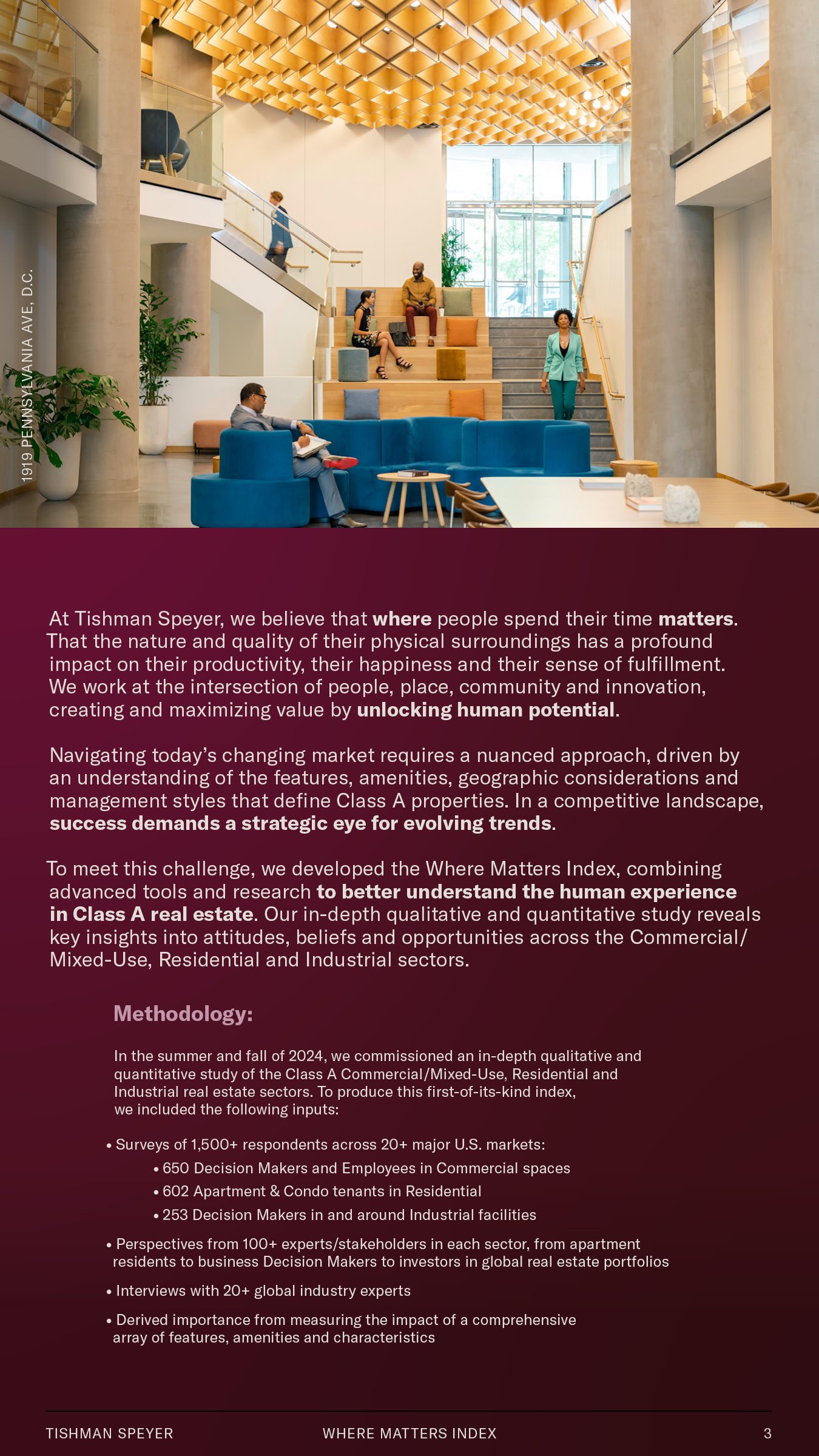
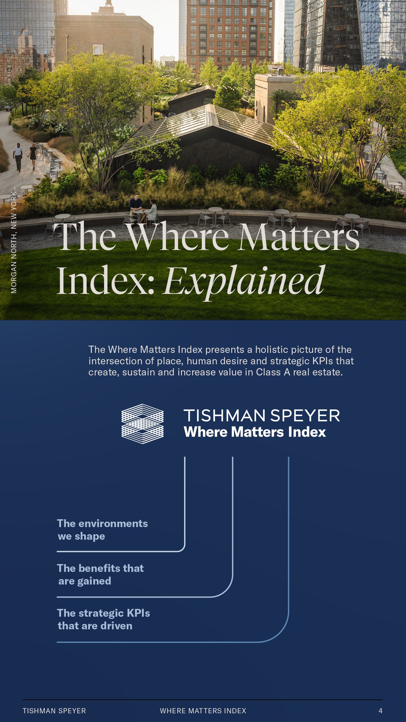
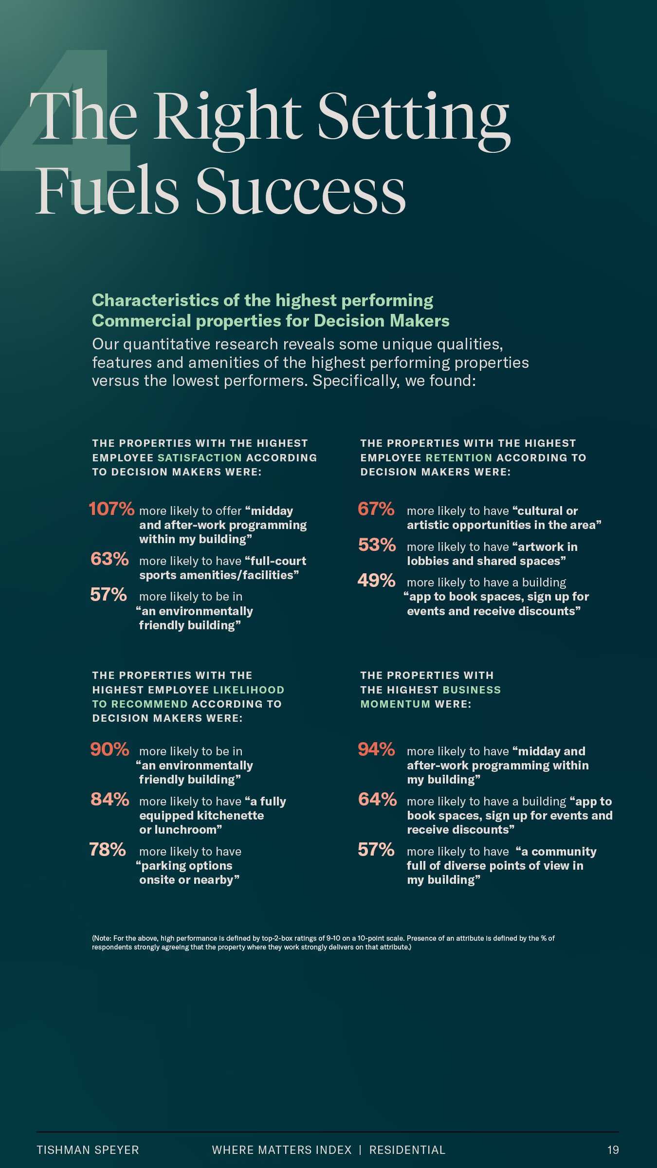
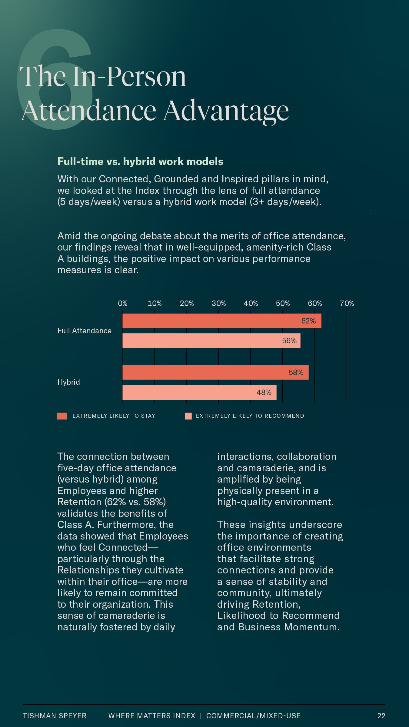
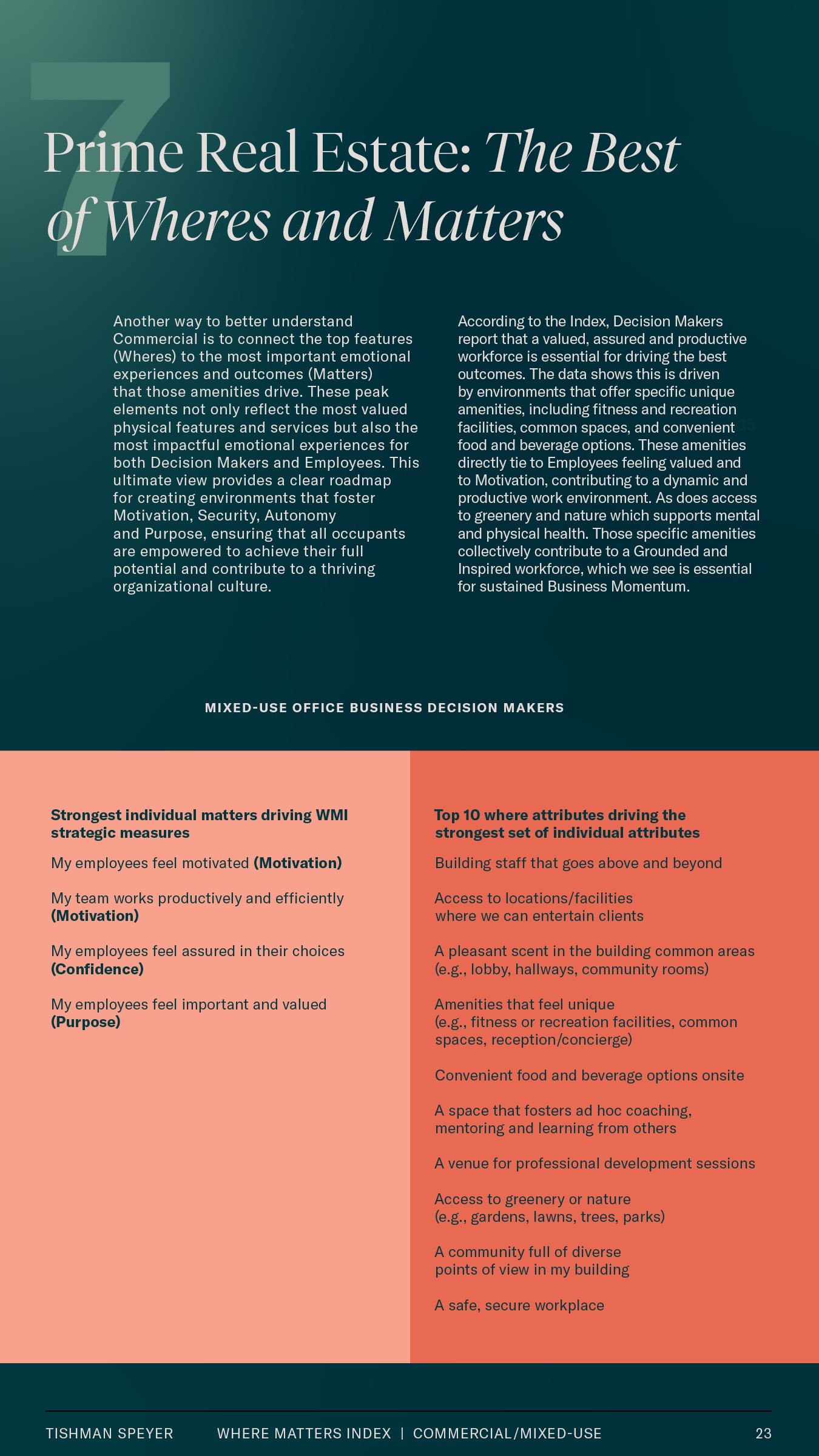
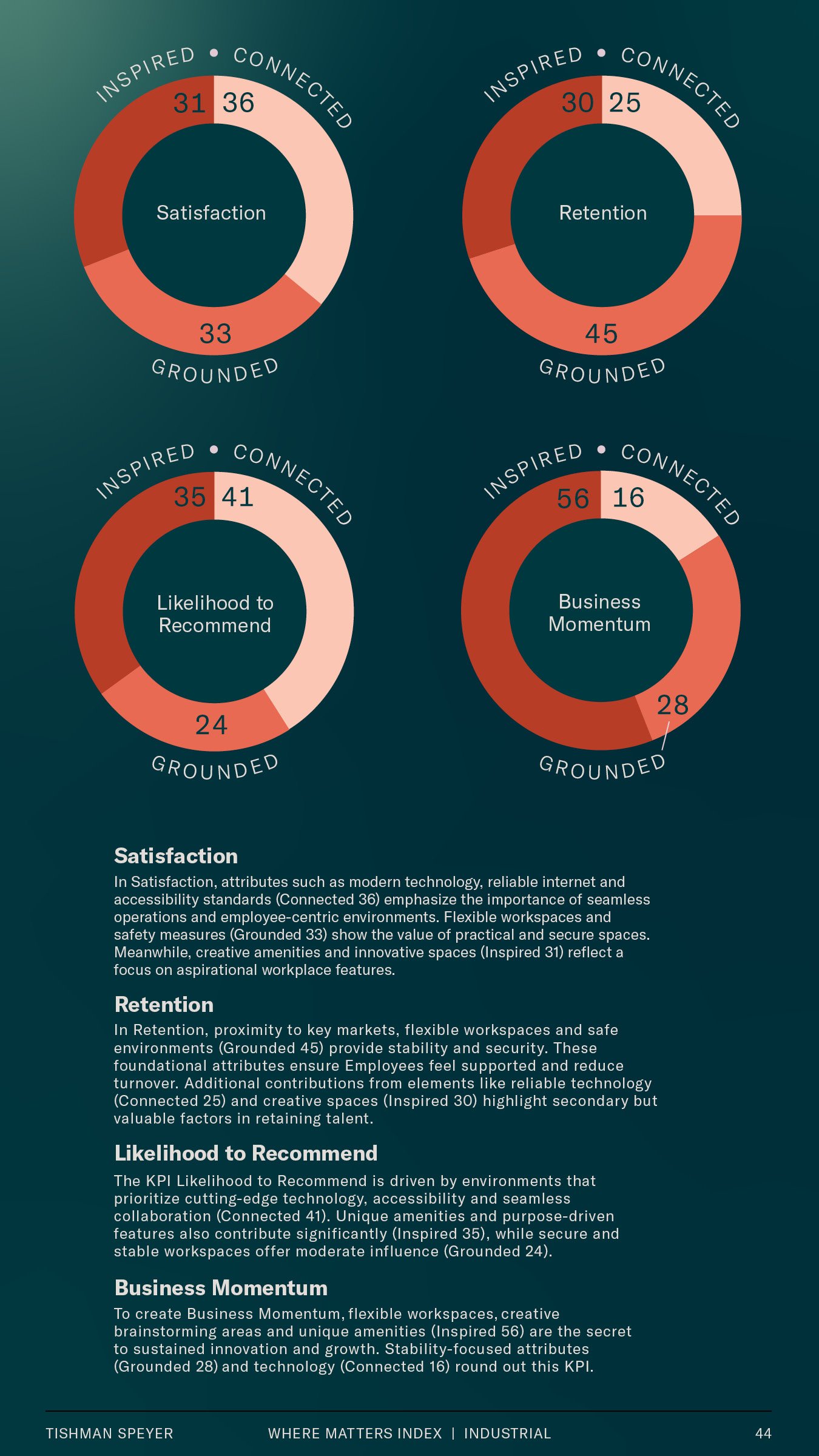
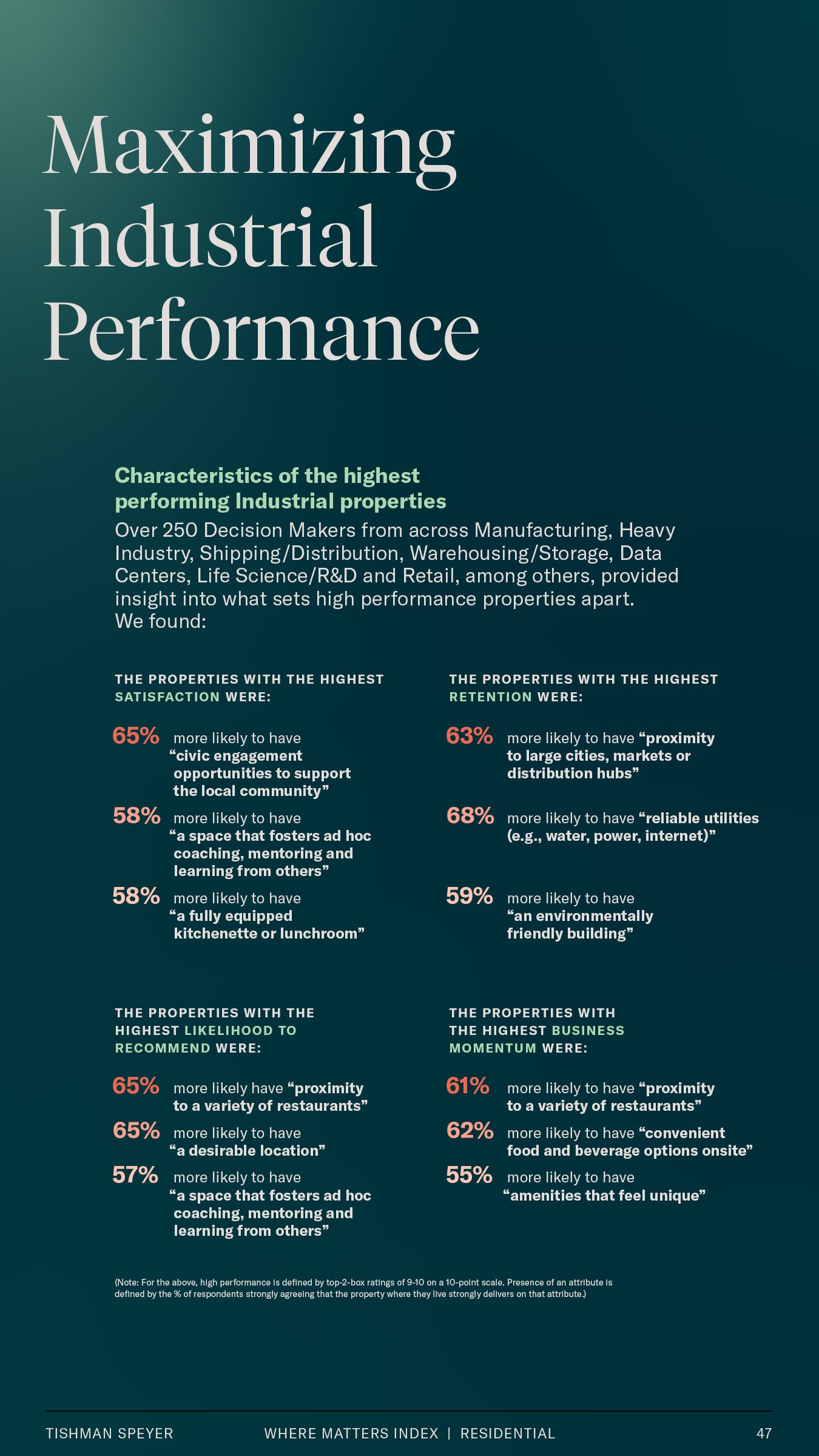
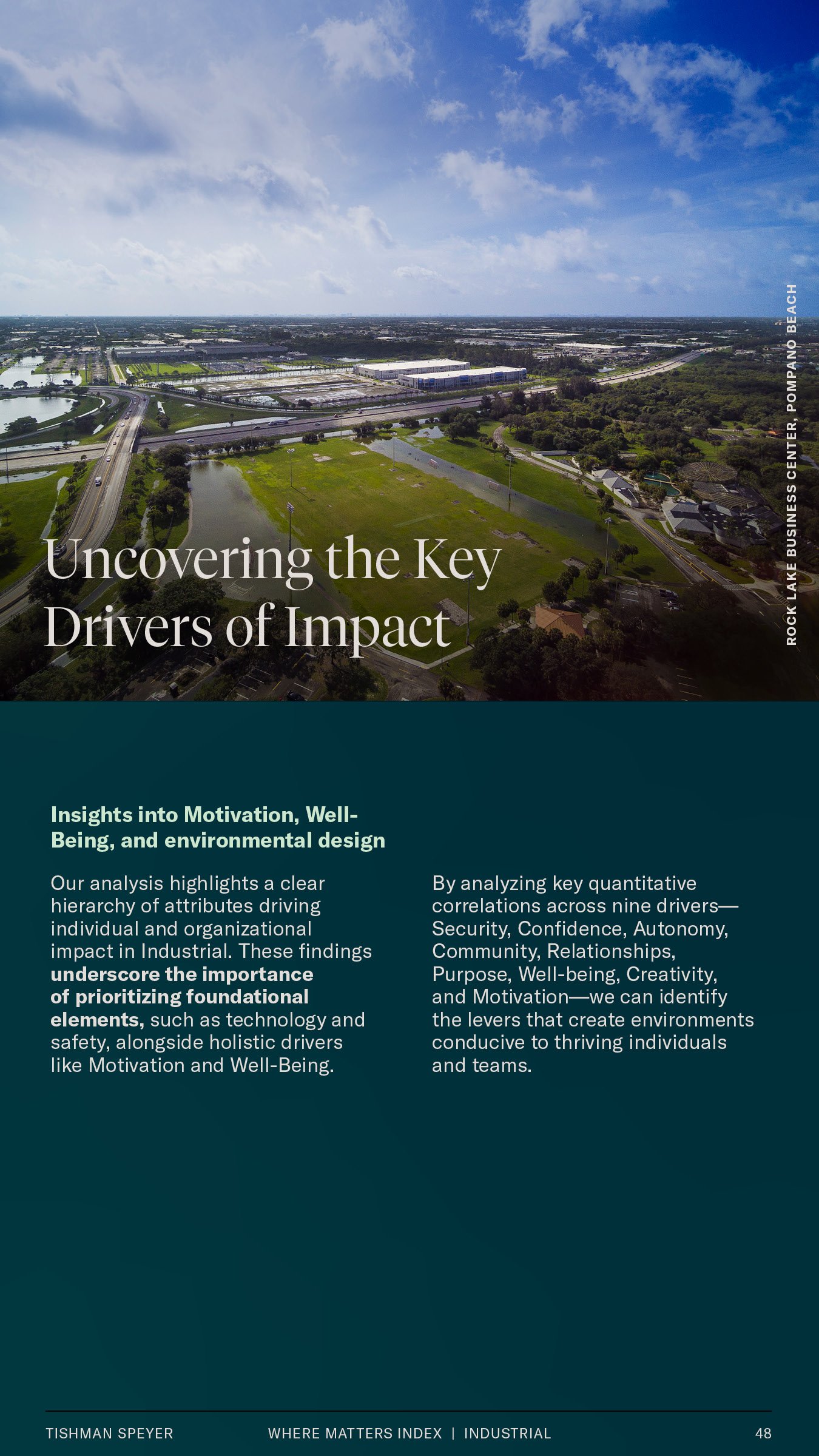
We’ve leveraged the pathways grid system to yield beautiful isometric and geometric data visualizations, while including inviting photography of slices of life in various modes of where they work, live and play.
Brand Statement
‘Where Matters’
Collectively, people are thinking about WHERE they want to spend their time now more than ever before.
Tishman Speyer continues expanding their business to be everywhere that matters, both geographically and with new lines of business to better serve their customers.
Tishman Speyer is building credibility based on their core business expertise, and continues to expand and diversify in new and innovative ways anywhere in the world.

Our Approach
We all know that Where Matters. Therefore, everything matters, including how we’re approaching this white paper. Flexing the Brand Guidelines to feel fresh by using distinctive, repeatable design systems that feel connected to the brand and content. Combined, a design that leverages Tishman Speyer’s existing standards to drive their industry authority, but elevates it to display an impartiality as a support brand was created.
White Paper Redefined
Design Spectrum
McKinsey/JLL

Tried + True
Trusted design where minimal color meets edge-to-edge content. Letting rich, info-packed narratives take center stage.
IBM/Gallup

Sleek + Modern
Elegance with a vibrant edge. Sleek designs energized by bold accent colors. Dynamic layouts with refined use of white space.

Invigorating and bold with dynamic typography. Vibrant colors and editorial style create a fresh, expressive harmony.
FutureBrand/Gensler
Fresh + Expressive
Our Design DNA
Factor 01

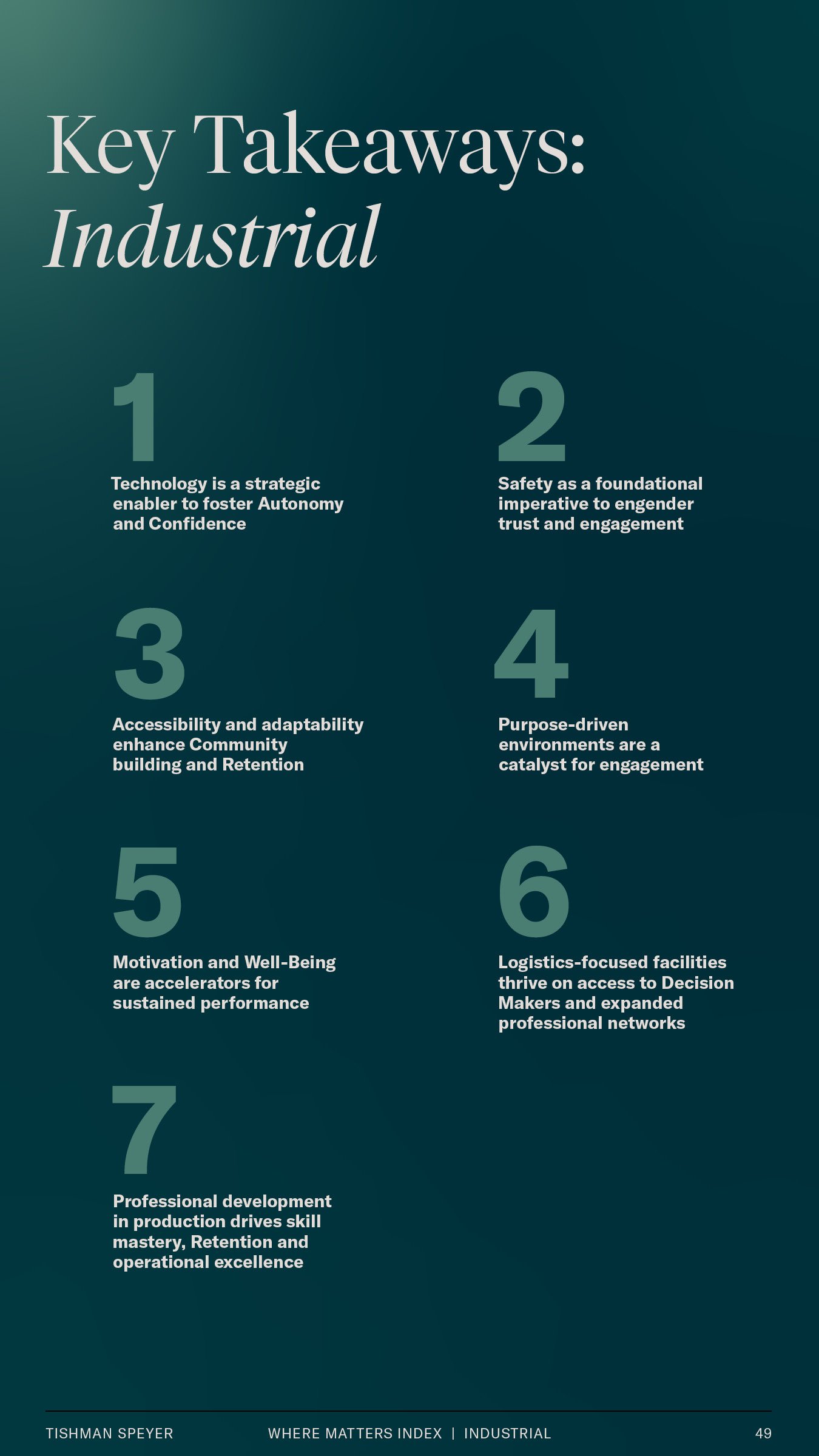
Clear Takeaways
Data transformed by Tishman Speyer’s visual identity, seamlessly woven into its unique style.
Factor 02

Striking Visuals
Bold and eye-catching with vibrant dynamism. Robust shapes and expressive colors redefine the visual landscape.
Factor 03

Dynamic Data
Captivating layouts with a bold expressive typography and dynamic info-rich content.
White Paper Toolkit:
Elements and Application
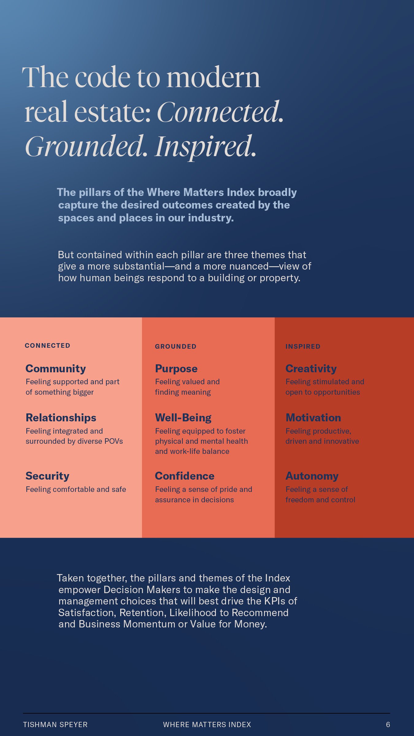
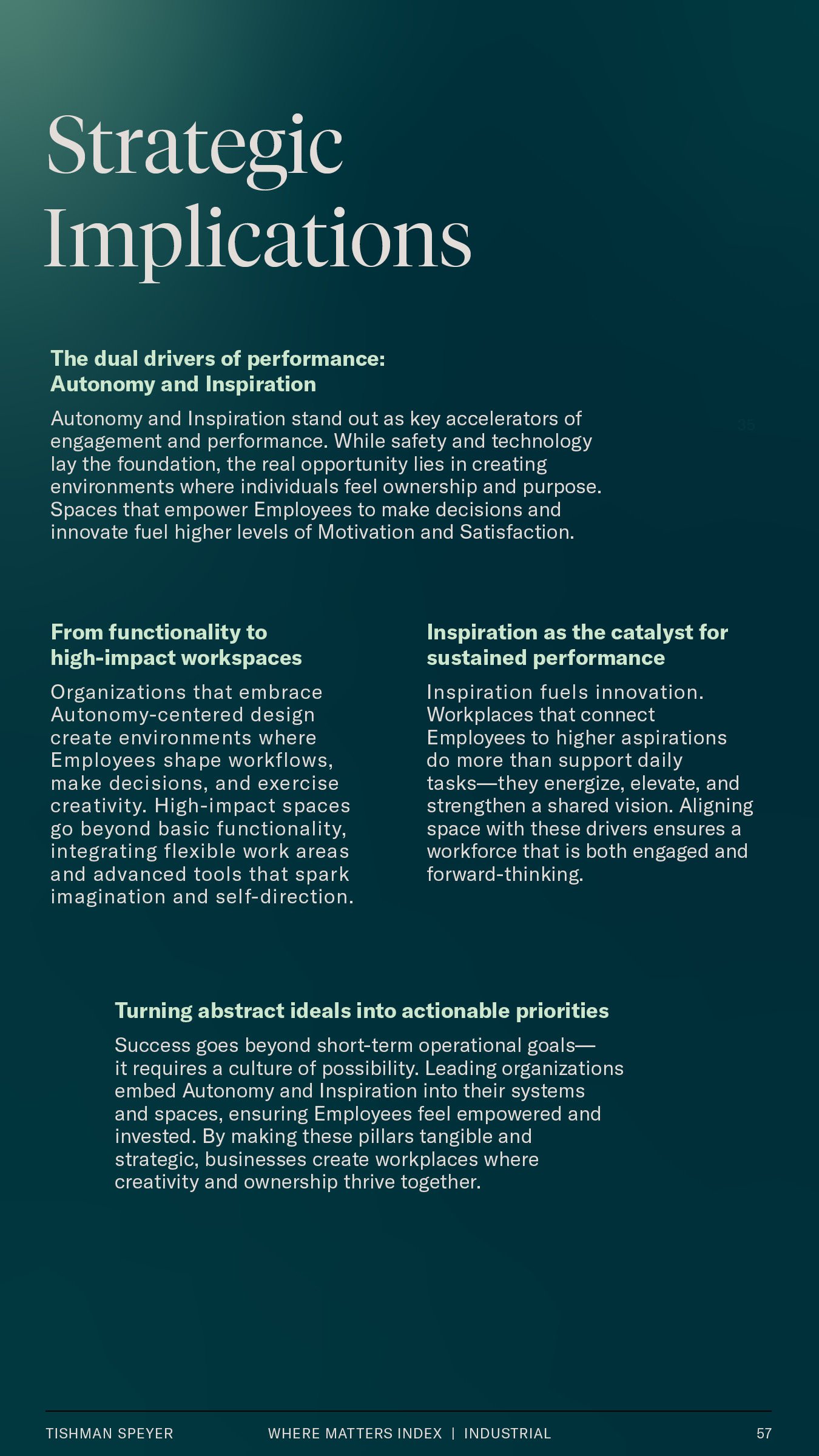
The design of Tishman Speyer’s white paper turns the meaning of “white paper” on its head by expanding the core Tishman Speyer color palette into various tints and expressive gradients, paired with typography celebrating the dichotomies of invention, humanity and letterforms that are both timeless and future-forward.
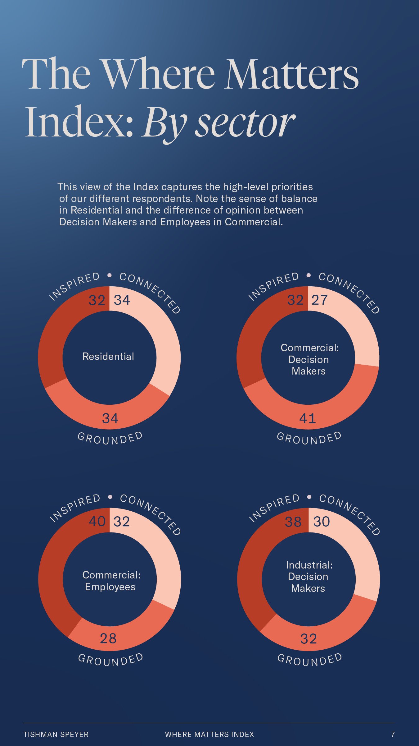
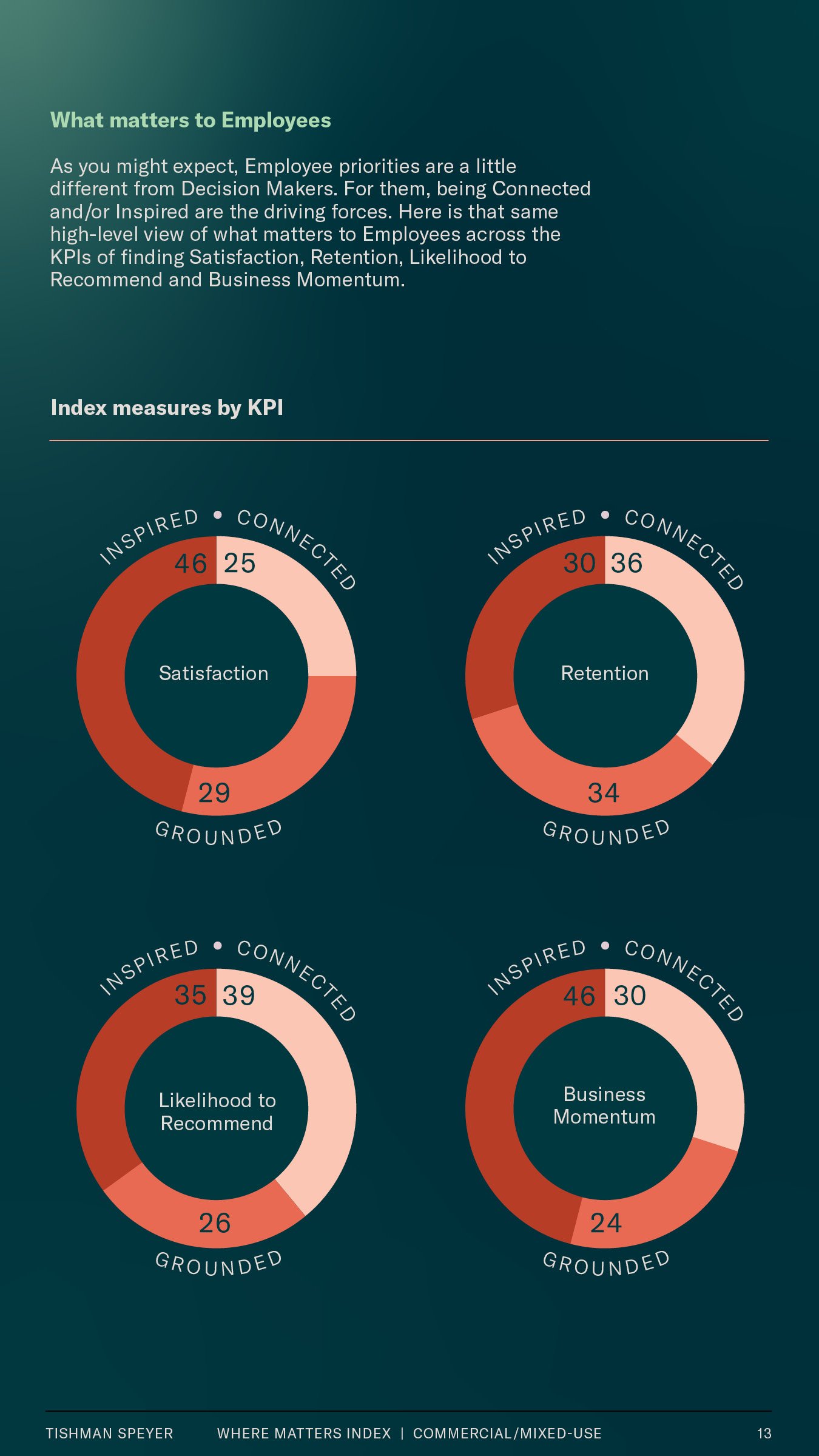
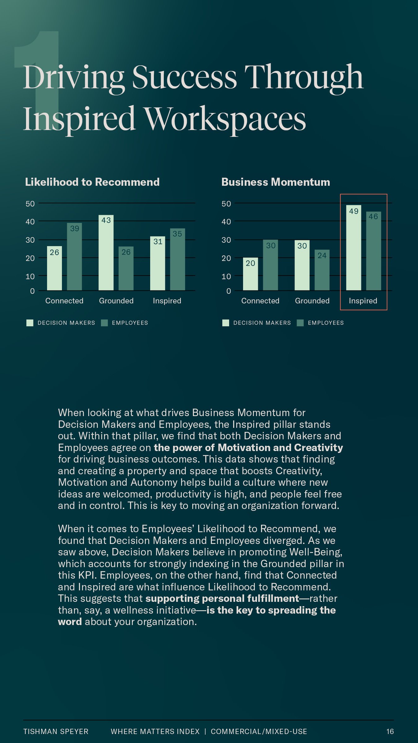
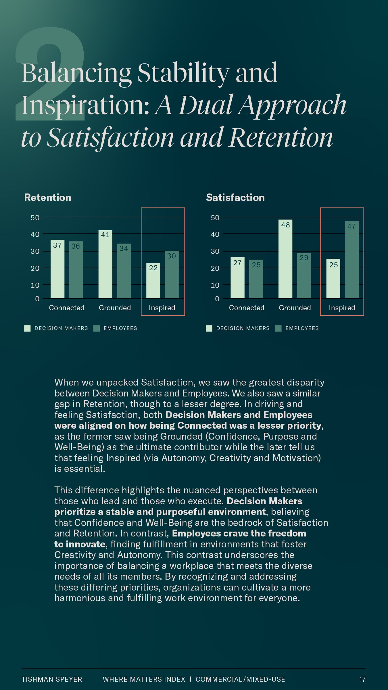
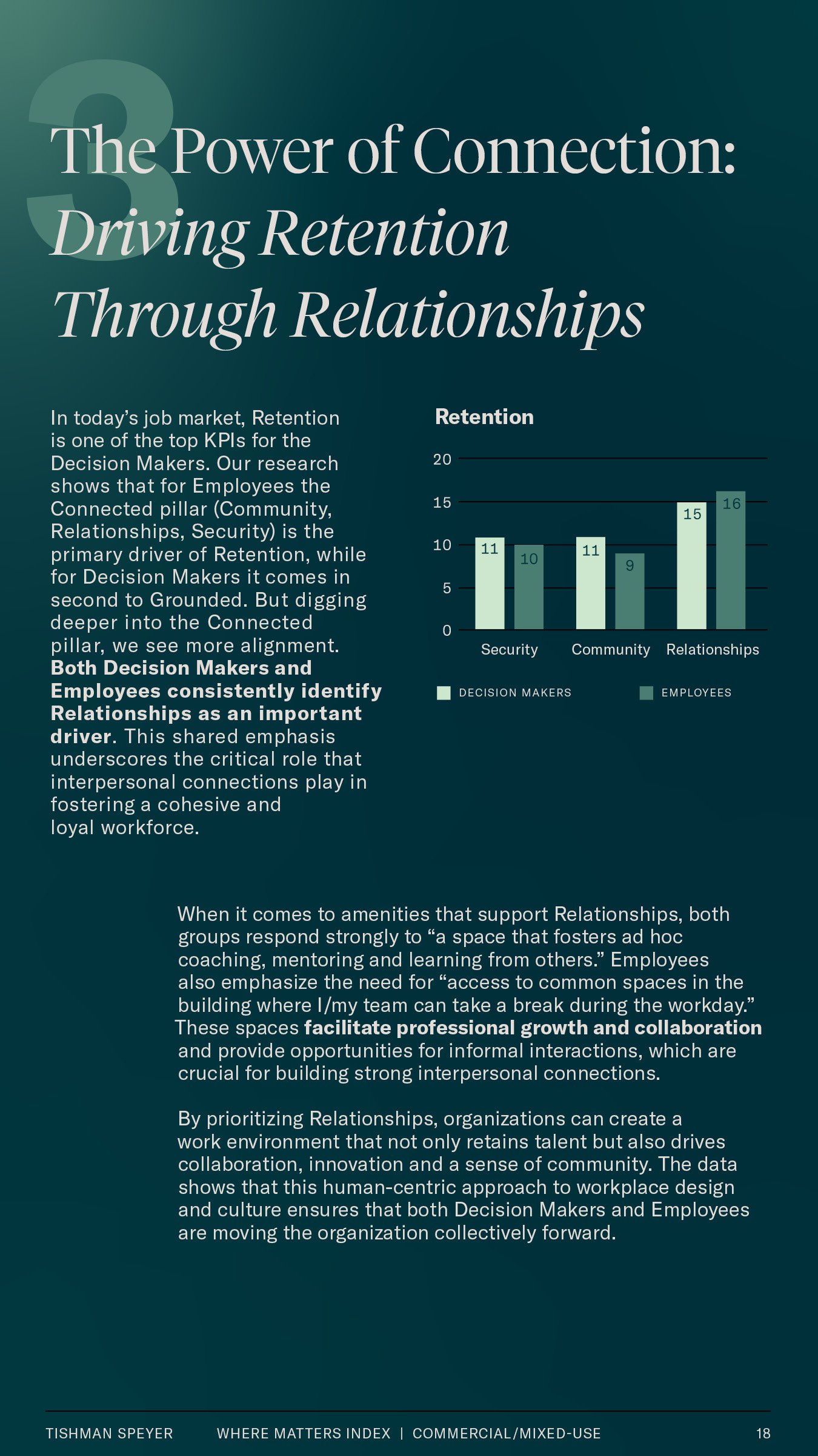
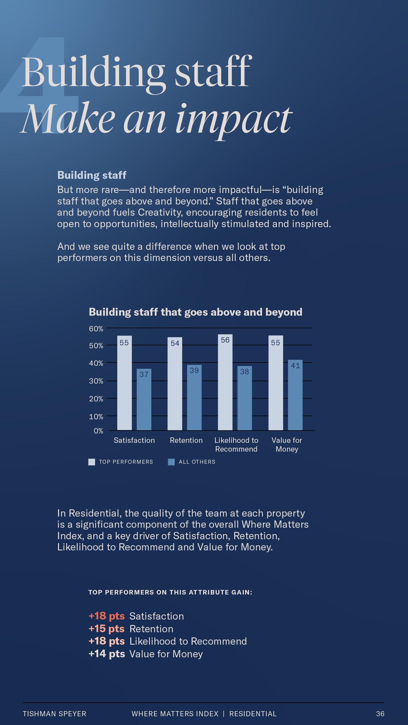
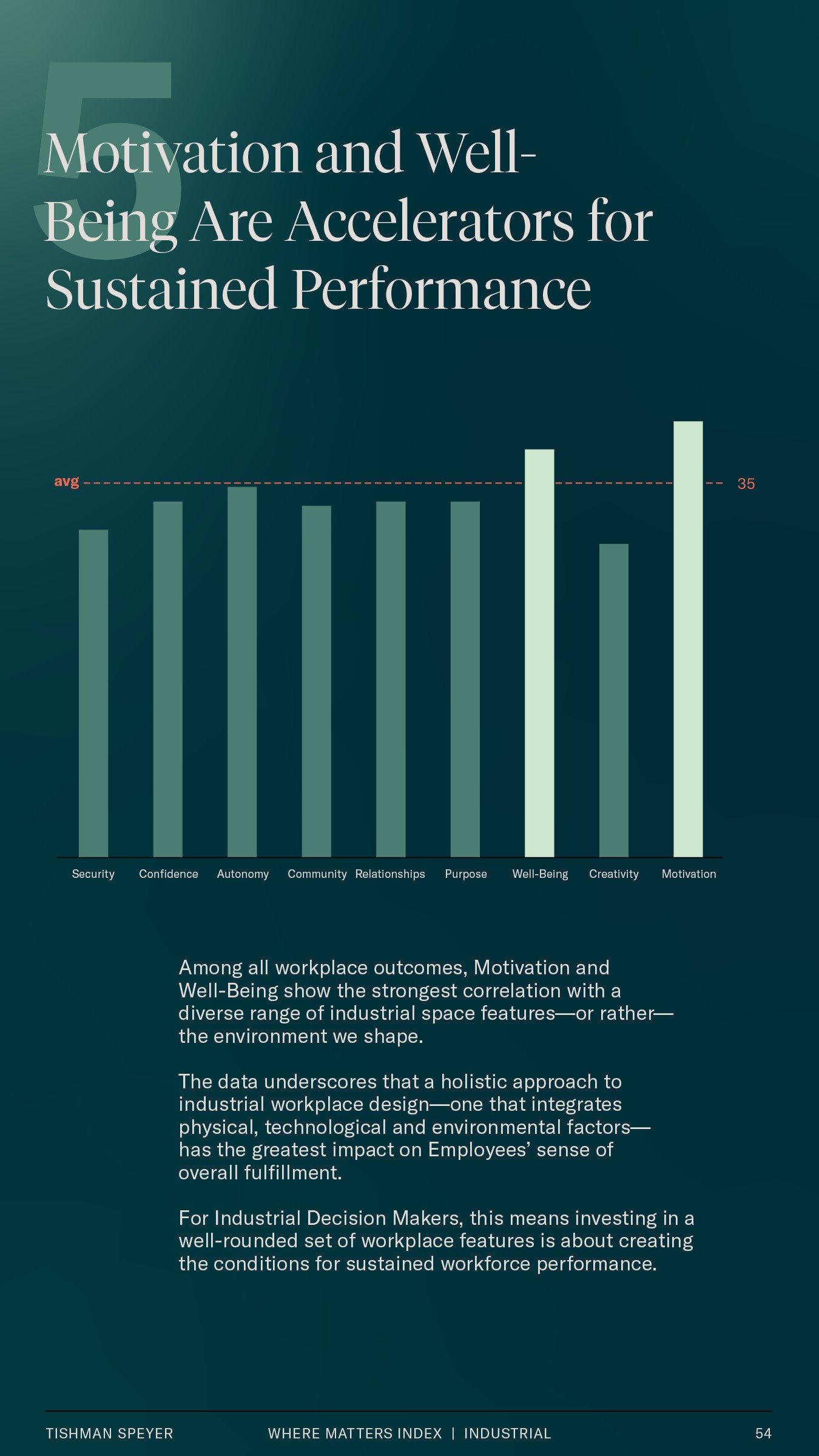
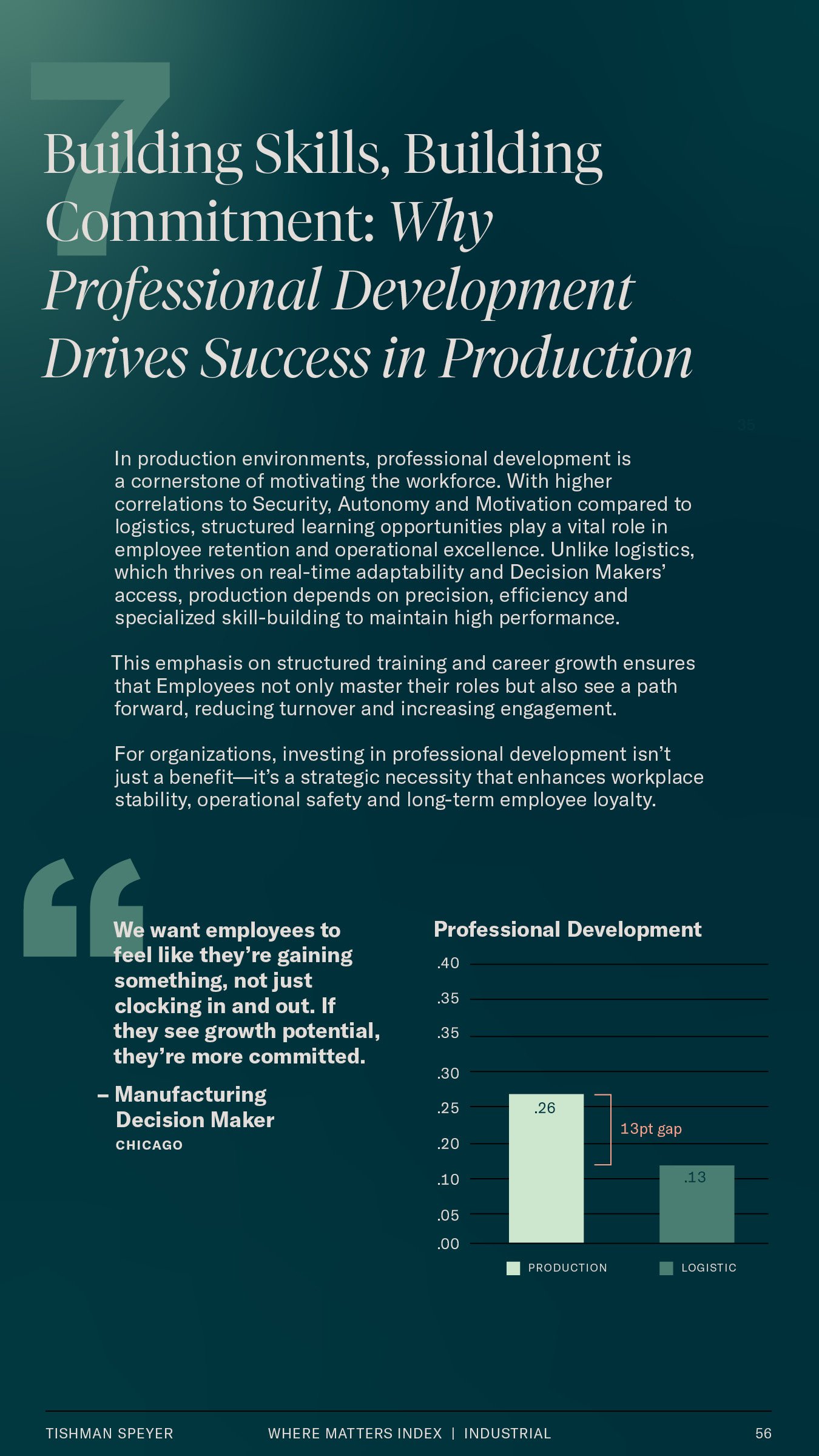
Data visualization is built in isometric forms, based on the geometry and angles of their pathway elements, derived from the Tishman Speyer icon. Colors from the expanded palette are used to further create dimension and life.

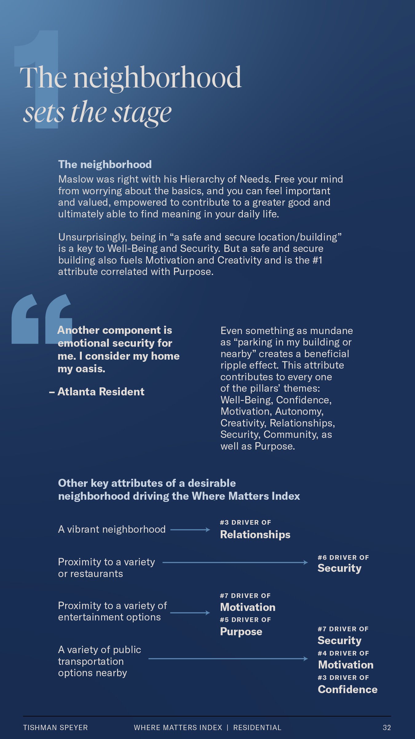
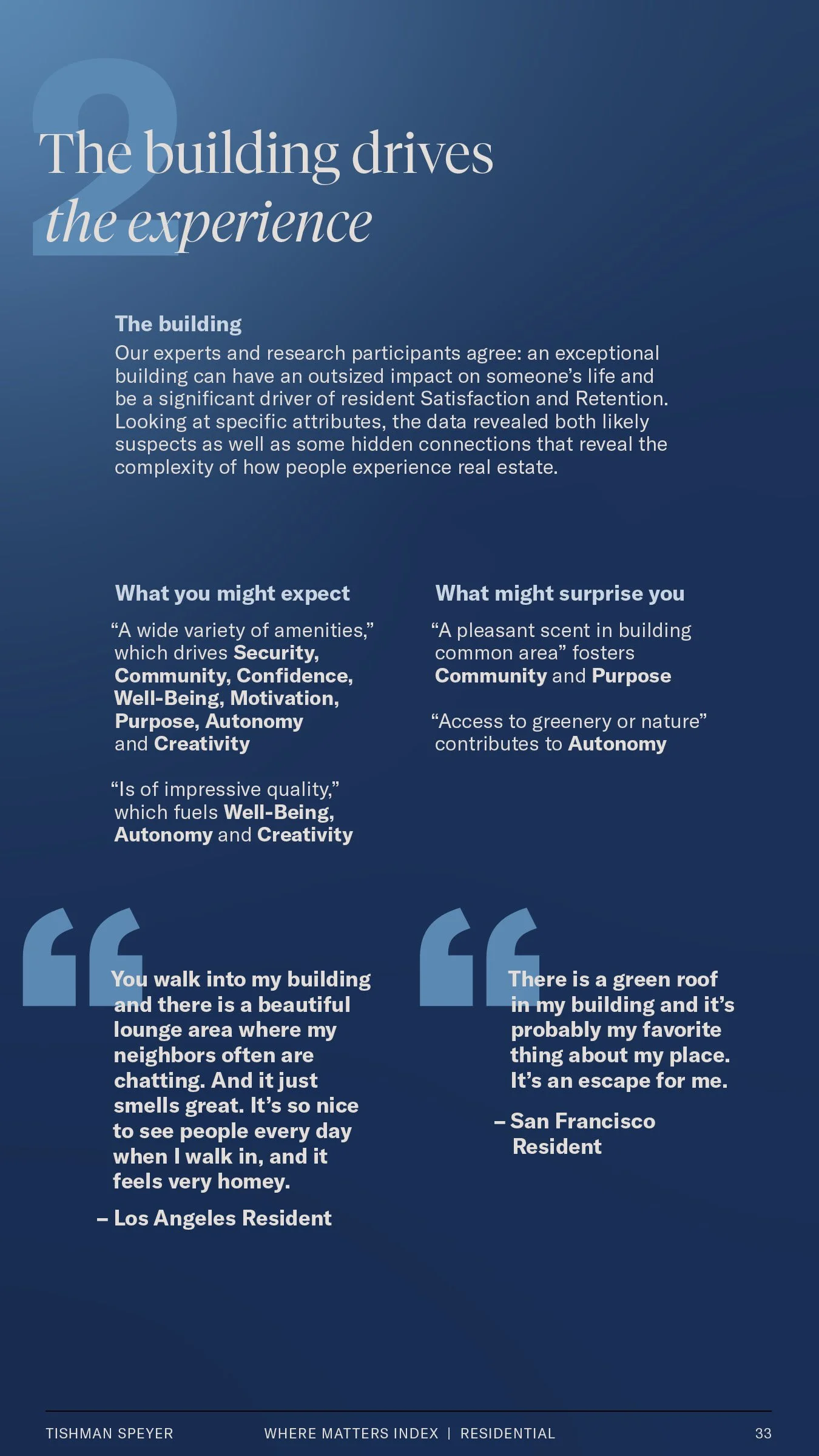
Built for the Small Screen
The Tishman Speyer Where Matters Index
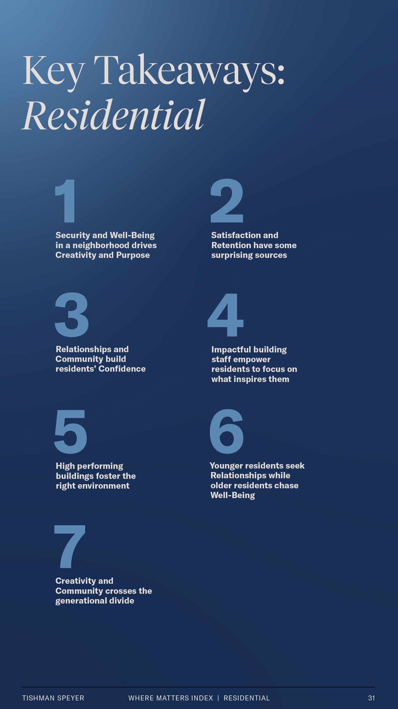
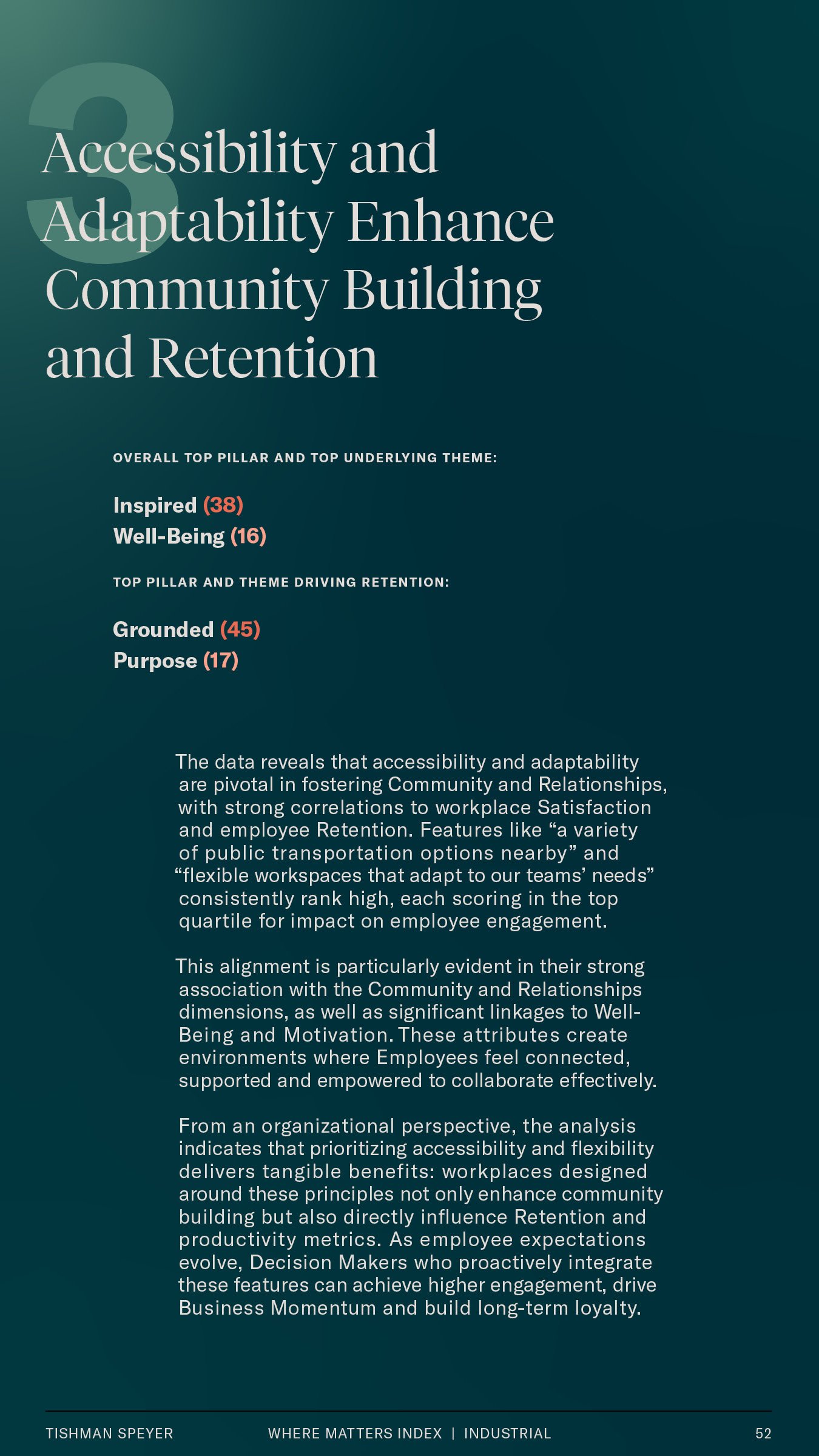
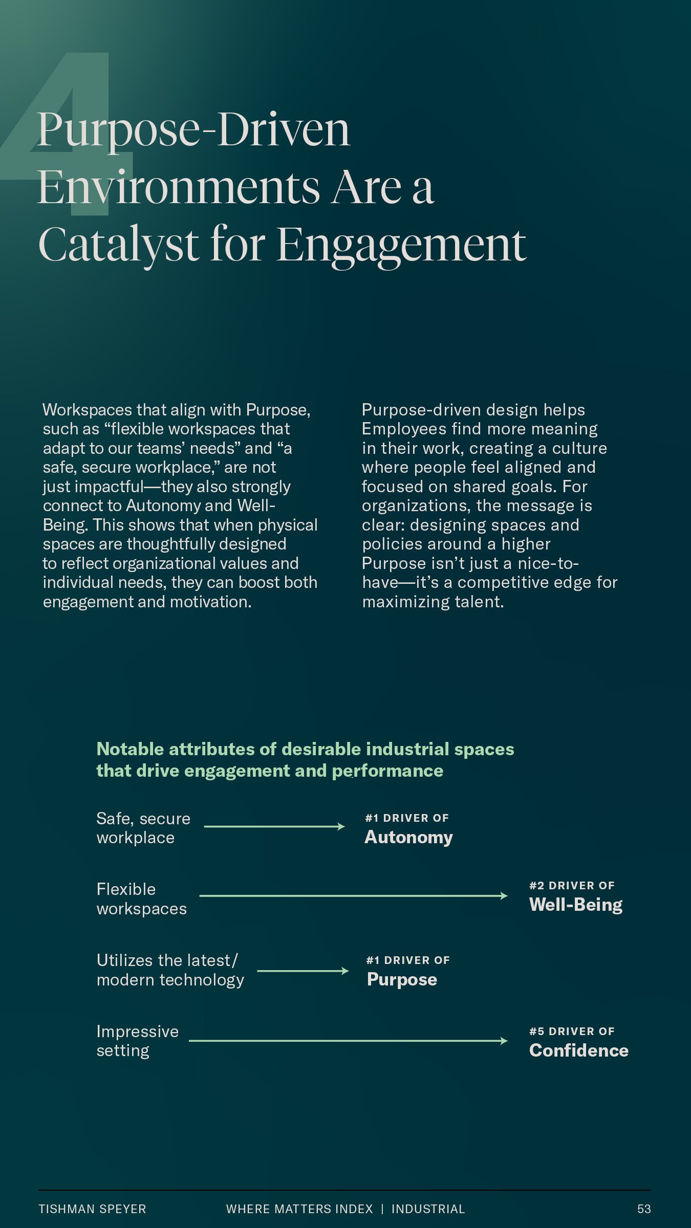
To ensure ease-of-use, our white paper took inspiration from other forms of data summarization like Spotify Wrapped and constructed it to be viewable on mobile devices.
View full PDF here or scroll the carousel below.


